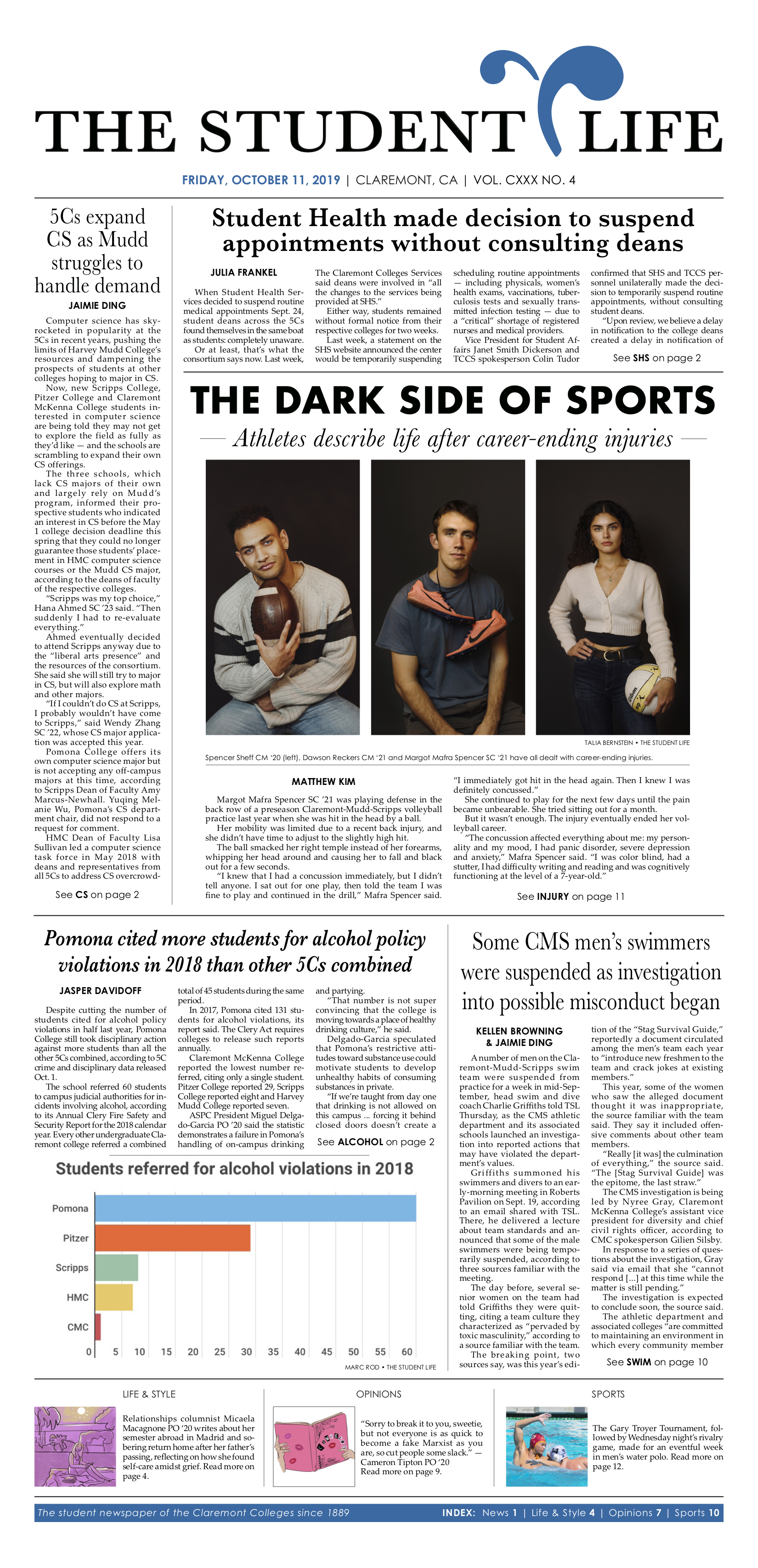
At the Claremont Colleges’ student newspaper, I served on senior staff as Production Editor and Senior Design Editor. I trained and led a team of five designers, producing an award-winning, weekly broadsheet newspaper. Before that, throughout my years of working in college newsrooms, I had worked in almost every role—copy editing, reporting, illustrating, and design. Eventually, as a jack-of-all trades, it put me in a position where I was able to fluidly communicate and work with the 130+ staff members of the college newsroom, tracking the production of each issue from pitch to print. The results of that project is shown here.
The Student Life is the oldest-running student newspaper in Southern California, published since 1889. Written and managed entirely by students, it serves the five liberal arts colleges of the Claremont Consortium—Pomona College, Claremont McKenna College, Scripps College, Pitzer College, and Harvey Mudd College. However, the newspaper looked dated and was not appealing to our audience of college students, raised in the digital age.
When distributing new issues, we’d often find previous issues still available since so few students were picking up the paper when it was released. We had to consider how most people on our college campuses recieve their news online, and reimagine how the print copy could be valued by students. Rather than simply thinking of the paper as a medium for the stories, it gave us a chance to view the newspaper, itself, as a product. Every week, I’d pose the question: If you saw this paper on the ground, would you pick it up?
(LEFT: Front page before the project; RIGHT: Front page at the end of project.)
As Production Editor, I began an overhaul of the design and style. In the first semester of implementation, we updated the bottom and top headers of the page, giving more space and air to the content and photos. Throughout the paper, we standardized the usage of heads, decks, and divider lines. We also took the opportunity to modernize the fonts and logo and typology that we used. It also allowed more colorful, creative spreads to stand out as unique and distinctly their own.
Eventually, we pivoted toward a thinner but longer size sheet. It fit better into student bags and gave a more sleek appearance. We also updated the logo, creating more space for content above the fold while maintaining a timeless style that we could standardize across platforms. With new sheet size, we turned toward skinnier fonts, maintaining a serif for a classic look, and drew inspiration from titles such as Wall Street Journal.
By my second semester as Production Editor, we cemented the process. Not only was it a great resource for training new designers, but the quality of our work showed: Our distribution sites would run out of the papers within 48 hours of release.
These designs won us several awards:
LEFT: 1st Place, Best Newspaper Front Page Design, California College Media Association (2020-2021)
RIGHT: 3rd Place, Best Newspaper Inside Design, California College Media Association (2020-2021)